Hands On With the Samsung Gear S3
by Joshua Ho on August 31, 2016 12:00 PM EST- Posted in
- Wearables
- Samsung
- Exynos
- Mobile
- IFA
- Tizen
- Trade Shows
- IFA 2016
- Gear S3
- Exynos 7270
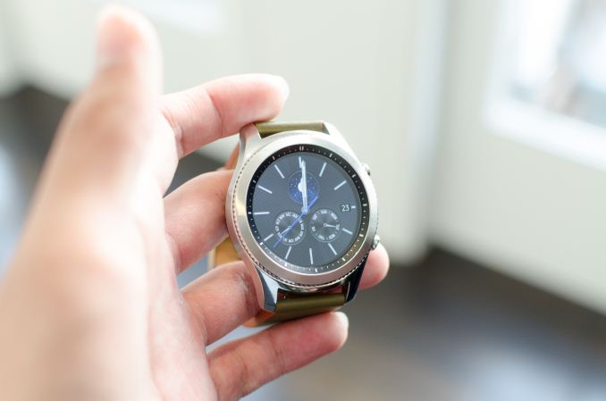
For a while now the smartwatch market has been developing in fits and starts. One of the more interesting developments in this space isn’t Android Wear and watchOS, but Tizen and webOS as both Samsung and LG have turned to their own homegrown OSes in cases where Android Wear wasn’t necessarily the best fit. It seems that OEMs have increasingly decided that it is necessary to control both hardware and software to better differentiate their offerings. In the case of LG we saw the Urbane LTE which necessitated webOS to enable cellular functionality, while Samsung in most cases has been pushing hard on Tizen in just about every case for their smartwatches rather than Android Wear.
| Samsung Gear S3 Classic | Samsung Gear S3 Frontier | |
| SoC | Exynos 7270 (2x ? @ 1.0GHz) | |
| RAM/NAND | 768MB RAM, 4GB NAND | |
| Display | 1.3" Circular 360x360 SAMOLED (278ppi) | |
| Dimensions | 46 x 49 x 12.9mm (57g) | 46 x 49 x 12.9mm (62g) |
| Battery | 380 mAh (1.46 WHr) | |
| OS | Tizen Wearable Platform 2.3.2 | |
| Sensors | Accelerometer, Gyroscope, Heart Rate, Ambient Light, Barometer | |
| Connectivity | 802.11/b/g/n + BT 4.2, NFC, MST, GPS,GLONASS, A-GPS (LTE Only) | |
With the Gear S3, Samsung is continuing to push ahead with their Tizen smartwatches, and this time the Gear S3 is intended as a sort of companion to the Gear S2 as the Gear S2 is closer to 40 or 42mm in size while the Gear S3 is a 46mm watch with a 360x360 circular AMOLED display which makes for 278 PPI. The display itself is covered by Gorrilla Glass SR+ which is said to improve scratch resistance although sand is probably still going to scratch the cover lens. The big jump in size basically rules out this watch for roughly half of the population, but the jump in size comes with a fairly significant bump in battery. Like the Gear S2, this is IP68 rated but I wouldn't actually try to use the device in a pool or shower as water damage isn't covered and the IP68 rating is basically only for distilled still water for a depth beyond 1m for at least 30 minutes, which really isn't enough to do much other than washing your hands with the watch still on your wrist.
There are also extra features like a speaker, and the Frontier model offers an LTE variant. While the Gear S2 has an Exynos 3250, the Gear S3 also gets a bump up to the Exynos 7270 but both US and Korean PR on-site were unable to answer what differentiated the two as both are 28nm SoCs with dual core 1 GHz CPUs. I would guess that the 7270 gets a bump to Cortex A35 or A53 but is still built on 28nm planar HKMG as it seems that it is difficult to justify the increased costs associated with either 28FDS or 14LPP/14LPC when volumes are not necessarily guaranteed in the same way that a smartphone is. Battery life with 28nm planar is said to be somewhere in the 3-4 day range for this watch, so I’m not sure people will really care all that much anyways. This battery life claim is with the always-on display feature, which is an innovation carried over from the Galaxy S7 and Note7.
In addition to the SoC, size, speaker, and other changes, the Gear S3 adds the ability to use Samsung Pay via either MST or NFC. In both cases it was noted that the phone itself much generate the token, so if you lose connection to a paired phone Samsung Pay will only work for one transaction on the watch. Authentication is done by entering a PIN when you first put on the watch and Samsung Pay is automatically disabled if the watch is removed similar to how Apple Pay works on the Apple Watch. Charging is still wireless. WiFi support is going to be limited by the nature of the device but 802.11b/g/n are supported as well as Bluetooth 4.2.
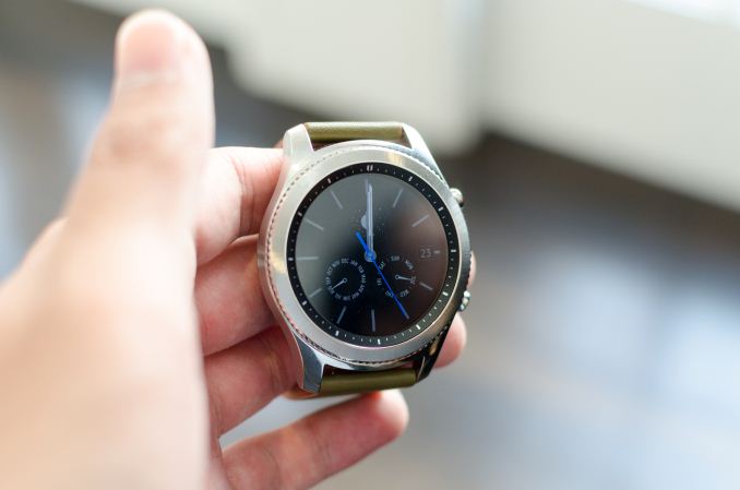
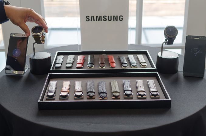
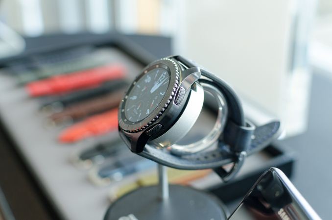
If you already know how the Gear S watches work there’s not much else to talk about, but this is actually my first encounter with the Gear S line of watches in any serious capacity. The Gear S3 in person is large, and basically is the same size as the Moto 360 in its first generation which was fairly large, but those with larger arms won't have any issues. I haven’t really used a watch that big since then so wearing one again was a bit of a shock for me. The Gear S3 as a result feels a bit awkward and ungainly in size relative to the smaller Gear S2, but if your arms are larger than mine it should fit without issue. The design of the watch itself is impressive though, with delicate detailing that makes both the Frontier and Classic variants of the watch fit in with existing analog watch designs.
Other than this size issue the thickness of the watch is fairly respectable. The sheer size of the watch allows for the circular display to display a reasonable amount of information, and the rotating bezel remains a great way of navigating through the UI with a solid click between each detent. The side home and back buttons are a bit of a mystery when you first use them, but after pressing them once or twice you’re probably going to remember which is which. The watch is also fairly performant compared to something like the Apple Watch which is just slow by any measure. The Gear S3 also includes GPS and GLONASS support which is useful for things like turn by turn navigation and services like Uber. Where the Gear S3 allows for precise location setting and map zoom using the bezel, the Apple Watch version of this application is basically just a button with no real way to know what the pickup point is. I did notice some frame drops here and there but it’s hard to say if this was really the case without much closer examination and it’s likely that this isn’t final software.
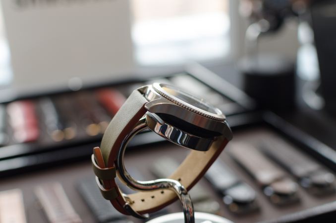
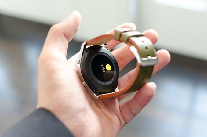
Other than this, the only thing I was really cognizant of was the band design. Generally speaking these are generic 22mm bands, but Samsung by default seems to favor very thick bands for demonstration purposes, and due to the traditional band mechanisms I found the band to be somewhat uncomfortable compared to something like the Milanese Loop bands seen in the Apple Watch. Of course, due to the standardized 22mm design anything is possible for band design, but generally speaking this is something that OEMs should really be taking care of.
The Gear S3 comes in two designs, known as the Classic and Frontier, and of the two designs the Frontier will be the only one that will come with a cellular variant. Both will come with a Bluetooth variant designed to be paired to a phone. LTE variants will only be available through operators, which are currently AT&T, T-Mobile USA, and Verizon.




35 Comments
View All Comments
JoeyJoJo123 - Wednesday, August 31, 2016 - link
I guess Samsung finally gets that people only really wear watches not because they need a device that tells the time, but because it's a simple, convenient, and classical accessory to wear.It's a digital age, and most people can find out what time it is on their phone, their car's time display, on their computer, on a TV, on clocks, etc. It's not like it's 1892 and the only convenient source to find the exact time was a watch.
That being said, I do like more classic styled watches that Samsung's making here. Nothing in the market was really addressing this, even Apple Watches looked like a novelty item compared to these.
Now if only they would contract Casio to help them make smart watches.
Samus - Wednesday, August 31, 2016 - link
What I don't get is how Samsung is clearly taking cues from timepiece historia, making a beautiful wearable, while Apple essentially just made an iPod Nano with a wrist strap and a crown dial.As an Apple Watch owner and having always worn a watch since I can remember (I think the first watch I wore at age 4 when the McDonald's happy meal came with a timex watch) I love watches, but I don't love the Apple Watch. It is bulky and ugly, but at the same time I'm lost without it. Each time it's been mailed out for repair (3 times in a year) I go back to a dumb watch or my old Pebble and am half naked without a functional calendar, sms and navigation device on my wrist. The health benefits of the Apple Watch alone are astonishingly good from Strava when I ride my bike to it reminding me to stand up when I've been sitting too long.
Of all companies, Apple shouldn't be the one so far behind on aesthetics.
MacBAir - Wednesday, August 31, 2016 - link
So the Apple watch, that most likely has less than half the volume of this Samsung watch, is bulky and ugly, but somehow Samsung's 2x bigger watch isn't?It's as if you are lying.
Samus - Wednesday, August 31, 2016 - link
It's bulky on my wrist because, since I have small wrists (and what they say about men with small wrists is not true, I assure you, it is quite alright down there - I feel I need to be very clear on this topic to the point I will talk about this topic more than the topic I am commenting on, so there) I have the small Apple Watch, which looks kind of ridiculous because its thick without being large (that's what she said.)/end Trump sarcasm
dsraa - Thursday, September 1, 2016 - link
Blue Oyster Nightclub much?name99 - Wednesday, August 31, 2016 - link
Oh please, can we drop the aesthetics nonsense. There is no such thing as absolute aesthetics, when it comes to watches or anything else. The same gothic cathedrals that we today consider beautiful were called first gothic as an insult. For every person who loves rococo, you'll find someone who loves minimalism.Samsung has adopted a style that matches the classic appearance of analog watches. Apple has adopted a style that matches what you'd expect from a wrist computer. One looks backward. one looks forward.
Vastly more interesting is the issues that AREn't covered here: the size of the device, how well it works in standard usage scenarios, how it compares to an Apple Watch running WatchOS3 (the real comparison would be against an Apple Watch 2, but obviously that's not feasible yet), things like that.
What's the nature of this "always-on display" that (presumably) allows for such low power usage -- it is something like mirasol (limited color range) or color eInk (slow)?
It's not clear how best to benchmark (performance, power) these devices, but I would hope that the review sites are already thinking about this.
One obvious test is of launch times (that's clearly a pre-WatchOS 3 pain point, and may be a Gear/Wear pain point?) but that becomes a less than helpful test if Apple (and everyone else?) begin aggressively "pre-loading" commonly used apps.
Another Apple pain point is how slow Siri is to launch and to react, so that might be something worth benchmarking on all the platforms?
As for battery, again that's tough. By far the biggest power draw on Apple Watch seems to be the heart monitor --- which means that a competitor could claim substantially longer battery life just by test heart rate say every 30 min rather than Apple's every 10 min.
Point of all this rambling is that there are phenomenal technical issues to be discussed here wrt all vendors. How about, for fsck' sake, in the light of this, and on a technical site, people SHUT THE FSCK UP about the ridiculously boring issue of "Well I think this one looks prettier than that one". Go discuss that on Vogue.com or on your Pinterest board, but how about we try to stick to technical issues here, huh?
name99 - Wednesday, August 31, 2016 - link
Sorry, Samus, that wasn't directed at you personally so much as this entire damn set of comments.name99 - Wednesday, August 31, 2016 - link
OK, now on to more useful information.One can compare the size of Apple watch to competitors (at the time, two years ago) here:
https://9to5mac.com/2015/03/12/look-how-much-sleek...
Comparing against the Gear S3 specifically,
Apple small is 38.6 x 33.3 x 10.5 mm = 13.5 cm^3
S3 is 46mm round x 12.9mm=21.4 cm^3
The current Apple watch (large, I don't know the number for small) battery capacity is 246mAh.
Next Apple watch is supposed to be 334 mAh (36% larger)
Gear S3 is 380 mAh. (So 55% larger than Apple Watch today).
Given the 28nm process used, the discrepancy between what is claimed and Apple today is astonishing. Apple tomorrow (ie WatchOS 3) likely has comparable performance, but there will still be a 3x or so difference in claimed battery life, for a 1.55x difference in battery capacity (and supposed always-on screen). I'm sure the more rabid fans will be happy to claim that this is all because Samsung roolz and Apple droolz, so the one can write superb power-optimized software while the other couldn't find it's ass with both eyes wide open; but I'd be interested in a rather more uh, technical, take on the issue.
My gut assumption is that both the OS and the hardware are doing rather different things, thus targeting different tech points. My guess is that Samsung is targeting the "watch+" model that Pebble went down, so (my GUESS --- tell me if I am wrong) the screen does not have the performance or color range of Apple (can it play movies, for example? could it in theory support APIs like SpriteKit and SceneKit?), there is less frequent chatter back and forth with the phone, and the sensors update less often.
Meanwhile Apple is targeting the "wrist computer" model with all that implies in terms of expectations from the screen and in how aggressively the watch remains synched with the phone.
FunBunny2 - Wednesday, August 31, 2016 - link
-- Apple has adopted a style that matches what you'd expect from a wrist computer.the classic wrist watch is square/rectangular and curved around the wrist.
Notmyusualid - Wednesday, August 31, 2016 - link
I use mine for running.I also much prefer the big 4:3 type of screen on my Gear S than the circular types since then. Easier to read, and touch.
The GPS with S-Health plot out my time / avg speed / and many other things.
I don't hit the road without it now, but the GPS aquisition time is a PIA.
As with the last one, the side buttons are the best idea here. Gear S touch screen can be activated by your jacket etc, pocket-dialling people anywhere in the world. With side buttons for activation, this could be prevented entirely.
I've not worn my Casio GPS watch since I bought the Gear S.