The HTC One Review
by Brian Klug on April 5, 2013 8:50 PM EST- Posted in
- Smartphones
- HTC
- Android
- Mobile
- HTC One
- Snapdragon 600
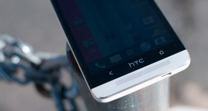
Probably one of the more polarizing design aspects of the HTC One is the inclusion of two capacitive buttons instead of the three we see on most other handsets that do include them. HTC’s rationale is that fewer buttons equates to less confusion for users, and as a result we have just back and home on the HTC One. For getting to the multitasking interface or task switcher, one double taps on the home button.
What’s notably absent on the HTC One is a menu button, which just like the other HTC Ones prior follows Google’s “say goodbye to the menu button” guidelines from early 2012. Unfortunately for HTC, just like the previous iteration of Ones, this means that unless an application properly implements the appropriate Android SDK level (11 or higher) it will have an ugly black action overflow button at the bottom. Worse, even some of the biggest developers and most popular apps (I’m looking directly at the pile of fail that is Twitter for Android) have failed to move to the new UI pattern or follow Google design guidelines. Last time around many blamed HTC for the action overflow button like it was an aberration of Sense. This actually isn’t entirely HTC’s fault, this is HTC getting burned for following Google’s hardware and software design guidelines which officially deprecated the menu button back in January 2012. Interestingly enough, in previous non-final builds of the HTC One software, there was an option for users to disable the action bar and press the menu button by long pressing the back button, which removed the action overflow bar entirely since the menu button is then implemented with a long press. However this has since been removed in the final software, and I strongly suspect Google is the reason here since they have final say about some of these things, and obviously nobody at HTC wants to waste pixels with a black bar at the bottom, since that was the whole point of going with capacitive buttons in the first place.

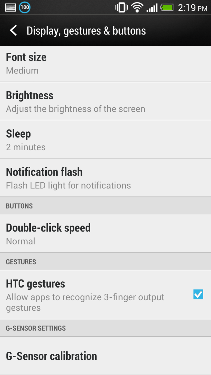
Twitter for Android (Left) whose action overflow bar does absolutely nothing. No option to change the behavior of the buttons for emulating a menu button in the final ROM (Right)
I need to stop here and note that I haven’t had any problems with the two capacitive button layout. I have yet to inadvertently tap the HTC logo once, nor is double tapping on the home button to access the multitasking screen difficult to internalize. As for the back button, in my brief time just playing with the build which had long press for menu, I had no difficulties either. I’m blown away, however, that the Android ecosystem has still yet to settle on a button layout that makes any sense, and no, the solution is not wasting pixels on painting buttons that don’t do anything but sit there. My experience is purely anecdotal however, and I’m switching between devices with myriad different button layouts so often and so regularly that my mind isn’t stuck in any one behavior pattern (nothing makes sense anymore, it’s just a surreal existence), but the two button system for me at least was little concern after the first ten minutes.
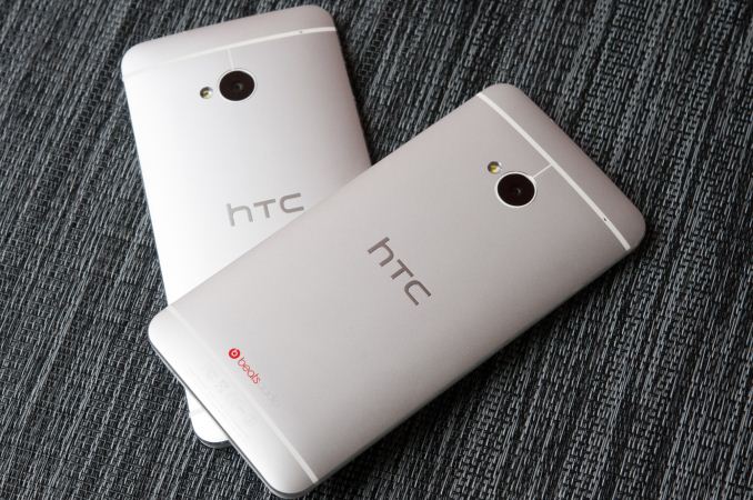
The HTC One industrial design is striking and unique, and that’s an understatement. There have been other largely-metal phones in 2013, and for that note, other largely-metal phones from HTC in 2012, but to call them similar looking or remotely similar to the HTC One is nothing short of a hilarious oversimplification. The HTC One feels unlike anything else on the market and marries just the right display size to just the right material choices and industrial design. The HTC One is without a doubt the first Android phone I’ve felt since the Nexus One that blew me away in terms of fit, finish, and materials choice. There’s something inherently valuable about metal that I can’t convey, and those materials choices drive the rest of the experience so strongly that I can’t help but get stuck on it every time I pick the phone up.
| HTC One Specifications | ||||
| Device | HTC One | |||
| SoC |
1.7 GHz Snapdragon 600 (APQ8064Pro - 4 x Krait 300 CPU, Adreno 320 GPU) |
|||
| RAM/NAND/Expansion | 2GB LPDDR2, 32/64 GB NAND | |||
| Display | 4.7-inch SLCD3 1080p, 468 ppi | |||
| Network | 2G / 3G / 4G LTE (Qualcomm MDM9x15 UE Category 3 LTE) | |||
| Dimensions | 137.4 x 68.2 x 9.3mm max / 4mm min, 143 grams | |||
| Camera | 4.0 MP (2688 × 1520) Rear Facing with 2.0 µm pixels, 1/3" CMOS size, F/2.0, 28mm (35mm effective), 2.1 MP front facing | |||
| Battery | 2300 mAh (8.74 Whr) | |||
| OS | Android 4.1.2 with Sense 5 | |||
| Connectivity | 802.11ac/a/b/g/n + BT 4.0, USB2.0, GPS/GNSS, MHL, DLNA, NFC | |||
| Misc | Dual front facing speakers, HDR dual microphones, 2.55V headphone amplifier | |||
Cases
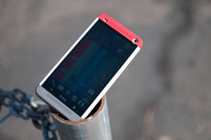
I had the opportunity to use one of HTC’s first party cases for the One, which HTC calls the Double Dip hard shell case. The hard case consists of three pieces — one large plastic component which slides on over the device, and two end caps which snap onto the top and bottom.
The case affords a fair amount of protection to the back and sides, and gaps the front display by a few millimeters as well to protect it from scratches if laid face down on a surface. I think the hard case looks awesome on the HTC One, with the grey, white, and red color scheme, I only wish there were some color options for the top and bottom snaps, which would make for cool personalization options.
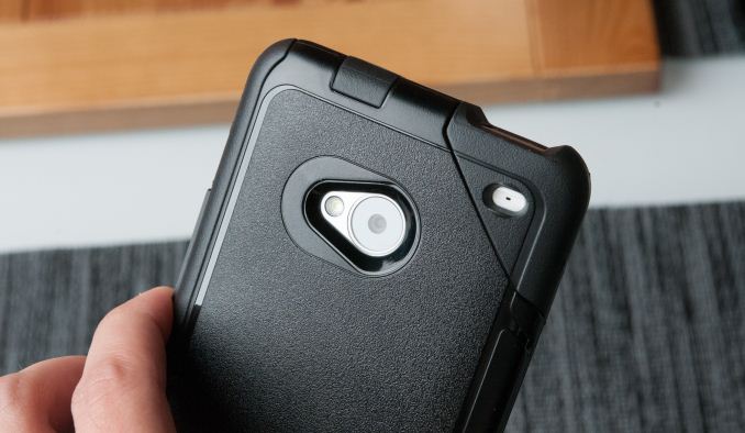
I also got to play with the Otterbox Commuter case for HTC One briefly, which is pretty much exactly what you’d expect it to be. It snaps on over the One and provides ample protection for all sides. It's a commuter case through and through, and if you're into Otterbox's style which trades some of the thin profile for a lot more protection, the case they've crafted for the One is great. I like the rubber cutout in the corner as well.
The unfortunate thing about using a case with the One is that of course you’re covering up all that great-feeling aluminum surface. The One is one of the first phones I really wouldn’t want to use a case with, so much so that it outweighs my natural impulse to protect devices from scuffing or scratching. Hopefully the One will get a nice patina after enough time.


