The HTC Flyer Review
by Anand Lal Shimpi on June 21, 2011 4:05 AM EST- Posted in
- Tablets
- HTC
- Android 2.3
- Mobile
- Flyer
The Hardware
Compared to early Android tablets the Flyer doesn't look very different. It's a 7-inch almost 16:10 tablet with a 1024 x 600 resolution. In the grand scheme of things however, this is a pretty different form factor - particularly for a tablet released in 2011. Apple set the tone for at least the first generation of tablets with the iPad: nearly 10-inches, and at least a 1024 x 768 display. Steve brought forth the iPad and it was good. The only problem with this approach is that tablets, like notebooks, aren't one-size fits all. People are different sizes (tiny vs. large hands) and usage models vary (couch surfing vs. portable computing device). While the iPad has clearly done very well, it's clearly not the only answer.
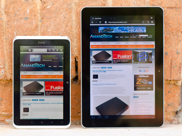
HTC Flyer (left) vs. Samsung Galaxy Tab 10.1 (right)
Viewed through iPad colored glasses, the Flyer starts out very different. In fact, it takes a page from RIM's playbook (giggle) and aims for portability rather than the comfort of a large screen size. I'll say the same things I said about the PlayBook about the Flyer: it's far more comfortable to carry around with me, but at home it's not as enjoyable to surf the web on. I think that's ultimately what separates the 7-inch tablets from the 10-inch models, portability vs. ease of use at home. It remains to be seen if Samsung's forthcoming 8.9-inch Galaxy Tab can really provide the best of both worlds.
I don't have particularly large or small hands but I can actually hold the Flyer with a reasonable level of comfort in the palm of one hand with my fingers gripping the outer edges.

Samsung Galaxy Tab 10.1 (left) vs. HTC Flyer (right)
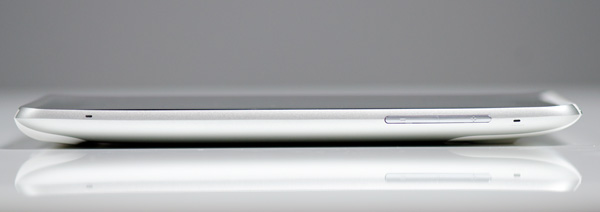
The Flyer isn't thin. At its thickest point it's 13.2mm, that's around half an inch. Even the original iPad is thinner. The back however curves out to that point and because there's not a lot of surface area it actually doesn't feel overly thick. I'd go as far as to say that the Flyer feels like it has a good grip to it.
The device is light by tablet standards at only 420 grams. Even the Galaxy Tab looks porky on paper by comparison. Again, in a smaller package the Flyer ends up feeling more dense despite its light weight. You can definitely hold the Flyer in a single hand without much fatigue, but I personally got the feeling that HTC's first tablet was about 10 - 20% over weight for its size. It's not bad, but not perfect. Don't feel too bad though HTC, in my opinion no one else has really gotten the whole form factor thing perfect either.
The HTC logo on the front panel implies that the Flyer is designed to be held in portrait mode, although obviously rotation is supported. In landscape mode there's a 1.3MP front facing camera in the center of the top bezel. Around back there's a 5MP rear facing camera as well.
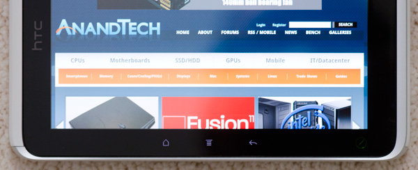
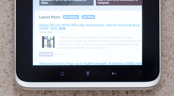
You can't rotate the Flyer in all directions however. Either the HTC logo or the front facing camera have to be at the top of the tablet. Holding the Flyer the other two ways won't rotate the screen. HTC does this because it actually has two sets of backlit capacitive buttons in the bezel around the screen - one set are illuminated in landscape mode, the other set in portrait mode:
It's a nice addition but one that forces HTC to limit the rotational freedom of the device. It's not a huge tradeoff, but one that doesn't exist on Honeycomb tablets since they integrate the standard Android buttons into the OS itself.
HTC only includes three standard capacitive buttons on the Flyer. From left to right there's home, menu and back. The search button is gone but not missed. Honeycomb also only includes three buttons (home, back and recently used apps), but it's just as quick to get a listing of recently used apps on the Flyer by holding down the home button. Some might argue that it's a quicker way of switching tasks than Honeycomb offers.
There's a fourth button on the Flyer, but this one is only accessible via the optional HTC Scribe - a battery powered digital pen accessory. I'll get to that bit in a moment.
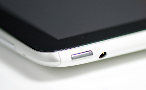
Up top there's a power/lock button with integrated status LED. The LED blinks green for notifications (e.g. new email) or glows orange when charging. If you don't do your homework it turns red. Next to the power/lock button is a tapered 1/8" stereo headset jack. The Flyer doesn't come with any earbuds, you'll have to supply your own.
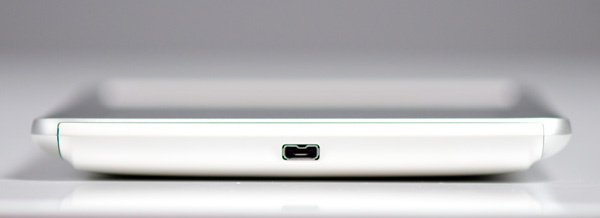
The left side of the device is barren and the right is home to volume up/down buttons as well as two microphones. Along the bottom of the Flyer is HTC's proprietary dock connector that's used for getting content onto the device as well as charging it.
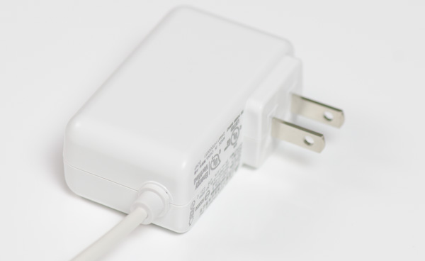
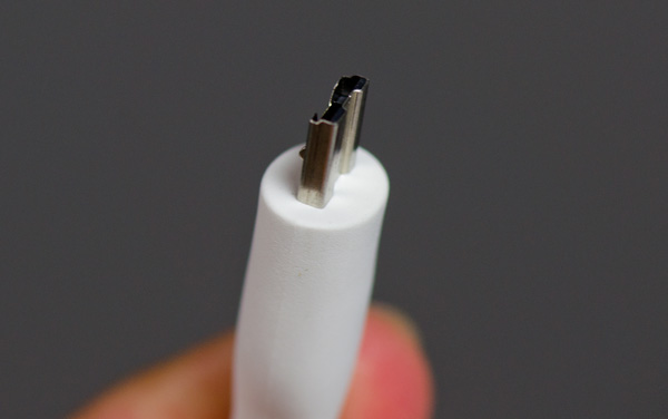
The Flyer comes with a power brick as well as a dock to USB cable. Unlike larger tablets the Flyer can charge (very slowly) off of a standard USB port while running.
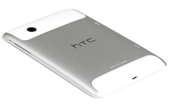
The back of the Flyer is all aluminum save for two plastic inserts. The bottom insert is immovable and feels equally stuck in place.
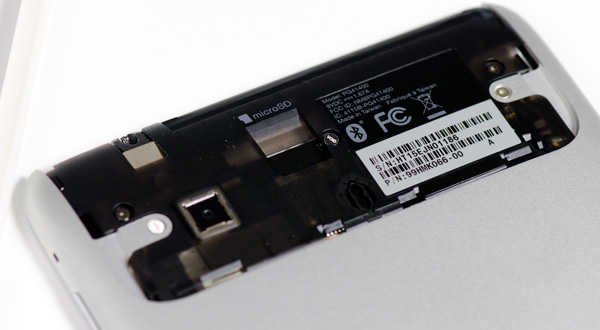
The top insert is a removable cover that hides the Flyer's microSD slot. I'm not a fan of hiding microSD slots behind large removable covers - it seems silly to have to remove something so big to access something so small. With the Flyer the removable plastic cover seems to somewhat ruin the point of the device's aluminum back. The removable cover definitely flexes under your grip and just doesn't feel as solid as the rest of the device.
There are two tiny speaker grills on the back as well for stereo sound. Sound quality isn't anything to write home about, the speakers get loud but harsh at the same time.




26 Comments
View All Comments
piroroadkill - Tuesday, June 21, 2011 - link
.. and should include the pen. Oh well.nitin213 - Friday, June 24, 2011 - link
At a recent roadshow in Singapore, HTC flyer was available for S$550 in a whispered deal (~US$460) and came bundled with the scribe and a cover.. I guess wait for similar deals in US if you really want it bundled.That said, I still went with an iPad even though i bought N1 immediately at launch. The key reason was quite simple... while numbers suggest that flyer is lighter, the smaller size meant it has much more heft and thus fingers get tired a bit faster (I was always holding flyer with a stronger grip). the scribe though useful addition wasnt always avlbl right away as there is no old-stylus style storage area on the tablet.. And lastly, the old adage.. never buy a first generation product from a company...I like HTC and am sure their next gen product would blow the competition, but flyer was not for me.
cheers
m.amitava - Tuesday, June 21, 2011 - link
I've seen that HTC Sense's facebook app captures higher res images of your contacts than the regular facebook app so that when you receive a call ( I am on a Desire HD on Gingerbread) from your contacts, their pic doesn't come out as a pixelated hash.So in that small way I do prefer the Sense implementation
Impulses - Tuesday, June 21, 2011 - link
HTC's whole FB contact integration system works better than the native one from the official FB app... That and the lovely lockscreen previews of calendar events, messages and music (plus app shortcuts now!) are the two biggest advantages that Sense has over stock Android. There's other minor things here and there (camera interface, motion sensing settings for the ringer, notification pane toggles, etc) but you can replicate most of them with market apps, and in some cases it's stuff that Honeycomb has addressed (and ICS surely will too).arbarath - Tuesday, June 21, 2011 - link
nice tablet.. but too expensive..therealnickdanger - Tuesday, June 21, 2011 - link
I wouldn't pay more than $200 for this. 7", not 10". Gingerbread, not Honeycomb. Poor battery life. You'd think with the that much thickness, they could have fit a huge battery in it. Oh well...xSauronx - Tuesday, June 21, 2011 - link
I think 300 or so is a fair price with the scribe stuff included, tops, considering the size and screen quality. Maybe 250 (since the nook color can pack an ips panel in a 7" tablet for that)but 500? No way. Why do companies keep pricing their devices so poorly?
Souka - Tuesday, June 21, 2011 - link
in attempt to recover part of development cost and because people keep buying themap90033 - Wednesday, June 22, 2011 - link
I agree this is a rip off and not that great of a product...Cow86 - Tuesday, June 21, 2011 - link
In Europe the pen IS included with every purchase, and the 16 GB model goes vor 499 euro's here...after the conversion maybe not really better value, but it's worth noting anyway. Puts it 20 euro's above the Ipad 2 16 GB wifi though, and I'm not sure a lot of people would pay that, except maybe the niche that really wants the scribe.