The HTC 10 Review
by Joshua Ho on September 19, 2016 8:00 AM EST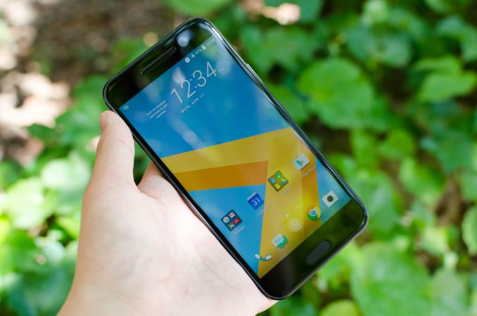
It probably goes without saying right now that HTC has been a troubled company for some time now. With the One M8 we finally saw that they were making a recovery, but with the Snapdragon 810 and One M9 HTC suffered a massive blow as their offerings just weren’t competitive with the Galaxy S6 or Galaxy Note5 for the time. Realistically speaking, any phone with a Snapdragon 810 or 808 just couldn’t really compete. With the launch of the Snapdragon 820, it seems that Qualcomm had finally launched an SoC that was a real improvement over the Snapdragon 801 and 805, and in the time since then we’ve seen a return to normalcy in the smartphone market.
A a result, HTC has been under fairly enormous pressure to perform this product cycle. Their attempt to meet that pressure is the HTC 10, which is the best of what HTC has to offer distilled into a single package. That distillation starts at the name, it seems, as this phone isn't called the One M10. There’s no One branding anymore, and the phone is just their tenth, and HTC is hoping that it’s a “perfect 10” in every respect.
| HTC One M9 | HTC 10 | |
| SoC | Snapdragon 810 4x Cortex-A57 @ 2Ghz 4x Cortex-A53 @ 1.5GHz Adreno 430 (TSMC 20SoC) |
Snapdragon 820 2x Kryo @ 2.15GHz 2x Kryo @ 1.6GHz Adreno 530 (Samsung 14LPP) |
| RAM | 3GB LPDDR4 | 4GB LPDDR4 |
| NAND | 32GB NAND + microSD | 32/64GB NAND + microSD |
| Display | 5” 1080p Super LCD3 |
5.2” 1440p Super LCD5 |
| Network | 2G / 3G / 4G LTE (Category 6/9 LTE) | 2G / 3G / 4G LTE (Category 6/9 LTE) |
| Dimensions | 144.6 x 69.7 x 9.61mm, 157g | 145.9 x 71.9 x 3-9mm, 161g |
| Camera | 20MP Rear Facing f/2.2, 1.12µm, 1/2.4" (Toshiba T4KA7) | 12MP Rear Facing w/ OIS and laser AF, f/1.8, 1.55µm, 1/2.3" (Sony IMX377) |
| 4MP Front Facing, f/2.0, 2µm (OmniVision OV4688) |
5MP Front Facing w/ OIS, f/1.8, 1.34µm (Samsung S5K4E6) |
|
| Battery | 2840 mAh (10.93 Whr) | 3000 mAh (11.55 Whr) |
| OS | Android 5 w/ HTC Sense 7 (At Launch) |
Android 6 w/ HTC Sense (At Launch) |
| Connectivity | 1x1 802.11a/b/g/n/ac, BT 4.1, (BCM4356), USB2.0, GPS/GLONASS, NFC |
2x2 802.11a/b/g/n/ac, BT 4.2, (BCM4359) USB-C, USB3.1, GPS/GLONASS (US, JP) GPS/GLONASS/Beidou (EU, Asia) NFC |
| Fingerprint Sensor | N/A | Capacitive |
| SIM | NanoSIM | NanoSIM |
| LTE Bands | Global: FDD 1/3/5/7/8/20/28 TDD 38/40/41 |
US: FDD 1/2/3/4/5/7/12/13/17/20/28/29/30 JP: FDD 1/3/5/7/13/17/19/21/26 TDD 38/41 Asia/EU: FDD 1/3/5/7/8/12/20/28/32 TDD 38/40/41 |
To figure out whether it really is we can start with the basic specs. HTC 10 shares quite a bit on paper with the Galaxy S7, but even here it’s obvious that HTC is putting their own sort of spin on things, going with LCD rather than AMOLED. I suspect that HTC is limited by what they can get from suppliers here though, as we’ll soon see. The other notable changes include the camera setup, as HTC goes with a larger sensor with laser AF rather than the somewhat exotic dual pixel system seen in the Galaxy S7 for PDAF on every pixel. If you were to just look at the spec sheet and play with the HTC 10 for a few days you might be inclined to think that it’s basically identical to the Galaxy S7, but as we’ll soon see there is a fair amount of differentiation when looking at the details.
Design
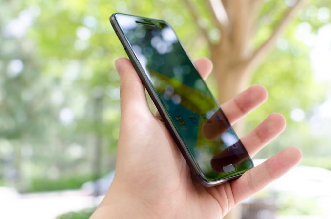
To start our examination of the HTC 10 the easiest place to look is the external design, which is probably something you’ll notice as soon as you take it out of the box. The HTC 10 is pretty much the first time since the original HTC One that HTC has done a major design refresh of their flagship. While it is still an aluminum unibody, with the HTC 10 the phone is basically all aluminum and glass to the touch, which is a noticeable contrast to the One M7, M8, and M9 which were all noticeably plastic in some way. While the One M8 may have seemed to be all aluminum, the speaker grilles were very obviously plastic if you looked too closely, and the One M9 had a very obvious and somewhat cheap-feeling plastic cover on the front of the phone.
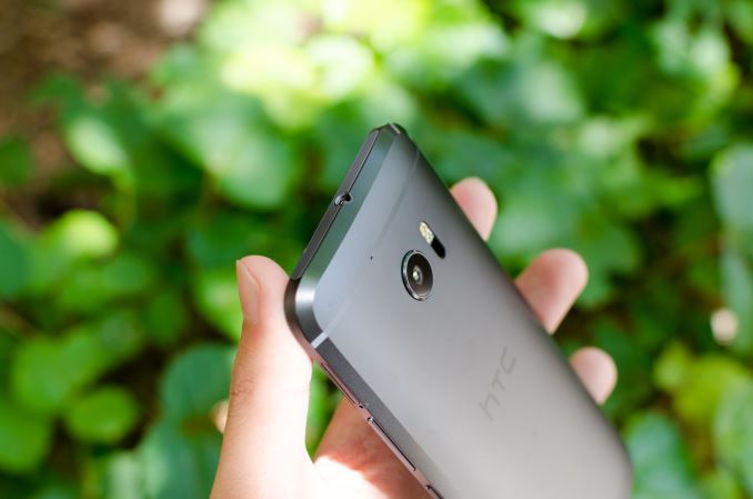
In contrast, the HTC 10 basically only has plastic injection molded to demarcate the external antennas, and a plastic RF window on top of the phone for its GPS antenna. The top and bottom “strips” of aluminum function as the antennas for all cellular, WiFi, Bluetooth, and NFC connectivity. HTC has also gone back to a circular camera cutout, which is definitely more HTC-like than the square cover lens seen in the One M9. In addition to an LED flash, there’s also an STM VL53L0 time of flight sensor which is used to help guide contrast AF search. However, unlike the dual pixel arrangement of the Galaxy S7’s sensor it’s important to note that distance cannot be mapped to focus in an open-loop fashion so a focus sweep is still needed to reach the final focus target.
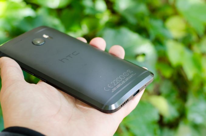
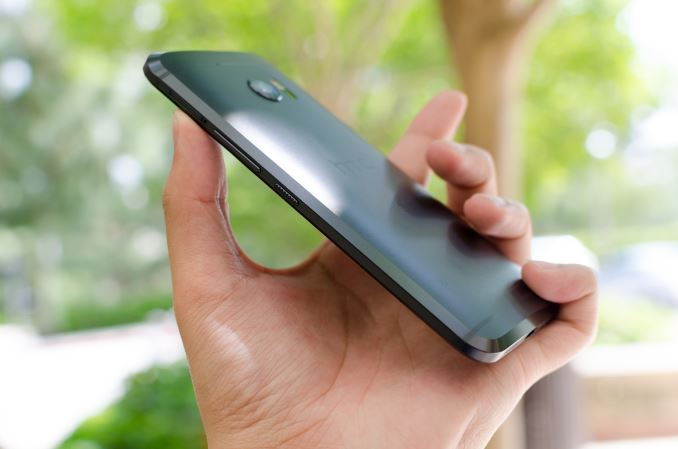
Moving past the camera, the back cover’s curved design ends with a fairly exaggerated glossy bevel that is unique for a smartphone. I thought that it wasn’t a particularly elegant design at first but with time it’s been growing on me as there’s a nice contrast between the sandblasted matte surface of the back and the glossy chamfer. The side and back of the phone are all integrated into a single piece, and side is a flat sandblasted surface with yet another glossy chamfered edge that meets with the glass. However, unlike an iPhone 6s the edge of the metal is slightly higher than the edge of the glass, which does cause a noticeable felt edge if you swipe off the edge of the phone. I suspect that this is done for durability reasons or something similar because the edge of the cover glass is curved, so it would be fairly easy and probably cheaper to have completely flat cover glass that wouldn’t have the felt edge. It's also worth mentioning that the 2.5D glass only begins to curve after the end of the display and capacitive buttons so a flat screen protector will cover pretty much everything important on the cover glass. While I'm not sure this is really intentional on HTC's part, it's helpful for those that use screen protectors after my experiences with the Galaxy S7.
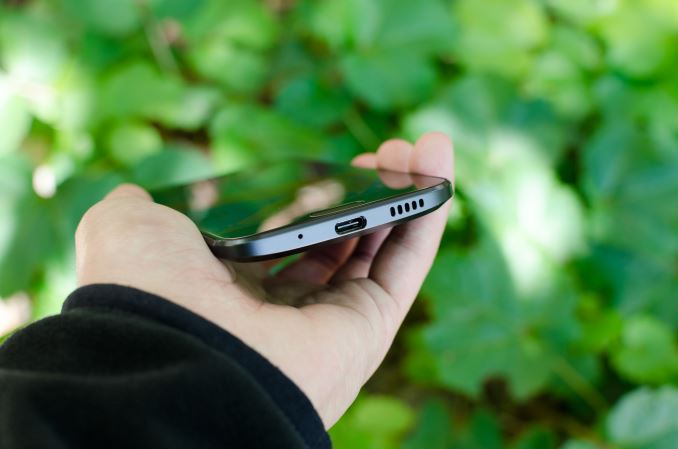
When it comes to ports and buttons, pretty much everything is along the sides of the phone. The top has the 3.5mm headphone jack, the right side has the power and volume buttons, and the bottom has the USB-C port and one of the two speakers. The feel of the buttons is dramatically improved relative to the One M9 which were rather soft and uncommunicative, and while the power button is still a bit too low for my taste the ridged design and increased resistance of the buttons means I’m no longer accidentally pressing the power button when I pick up the phone. The buttons themselves are also made of aluminum and break more cleanly when you press on them, which helps to make the phone feel more solid.
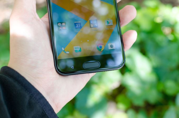
The front of the phone is now all glass unlike previous designs, and honestly as a result it looks much cleaner than before. The top of the phone contains the second of the two speakers and the optically-stabilized front-facing camera. Under the display, there is a Fingerprint Cards fingerprint sensor that is purely capacitive and functions as a home button as well as capacitive buttons that are enabled by a Cypress CapSense controller. HTC retains their traditional layout with their display driver on the bottom between the display and fingerprint sensor/capacitive buttons, but due to a move back to capacitive buttons the typing ergonomics of the HTC 10 are dramatically improved and on par with the One M7. While it is possible to enable front-facing speakers without the kind of bezel requirements seen in the One M8 and M9, for a ~5” class device it seems that it’s realistically only possible to fit in one front-facing speaker, while phablets generally have more internal volume in the x and y directions to enable more creative speaker placements to enable the second front-facing speaker without major increases in bezel. It’s notable that HTC has finally eliminated their logo from the cover glass of the HTC 10, which is something I’d say is worthy of mention here as it makes the design of the phone much cleaner from the front. It would be pretty impressive if HTC could move the fingerprint scanner under the cover glass for next year here to have a truly seamless design.
While simple description of the design is one thing, after a few months of use one thing that really sticks out to me is just how incredibly solid the design of the HTC 10 is. It’s just incredibly stiff and doesn’t seem to give like any other phone. I usually can feel or hear the back cover or the display assembly flex slightly when I’m applying pressure to these areas on most phones, but the HTC 10 is basically completely free of flex. I don’t really mind if a phone isn’t completely solid, but it is still impressive to see how strong the HTC 10 is. I don’t think this has an impact on drop protection but I don’t think you’re going to accidentally bend the HTC 10 putting it in your back pocket or something similar.
The HTC 10 also seems to have a remarkably symmetrical design for an Android device. Visually, the 3.5mm jack is centered both horizontally and vertically. The laser AF module and LED flash join together with a line that appears to bisect the camera lens.The bottom microphone hole, speaker holes, and USB port appear to all be the same distance from the display. The USB port itself is visually centered the same way the 3.5mm jack is. The front-facing speaker on the display is also visually centered, and the front-facing camera is bisected by the speaker grille visually. The one notable area where the design has some asymmetry is the placement of the fingerprint scanner and capacitive buttons due to the display driver. There’s also some asymmetry with the SIM tray and microSD tray due to the pyramidal stack that HTC retains with the HTC 10. I suspect that symmetry would be possible for the home button, but would cost additional bezel that would affect ergonomics. The LED notification and ALS/proximity sensors are not really aligned with anything, but HTC has managed to hide these things fairly well. Regardless, the design feels more thoughtful than what we’ve seen on the Galaxy S7, which is acceptable and doesn't affect function but basically nothing is aligned. I would argue that it's also more thoughtful than the Note7, but your mileage may vary here.




183 Comments
View All Comments
ChronoReverse - Monday, September 19, 2016 - link
Thanks for the very indepth review. I already own the HTC 10 and like it a lot but I still like reading about the details like the wifi testing.Vagabondjonez - Monday, September 19, 2016 - link
thanks for getting this out Josh. Theres alot of things we could still talk about. The charge test always seem off to me. I know about varying conditions ,but the G5 can definitely top up in 1 hour and 19 minutes with included wall adapter in a 70° room on a plastic surface made partially of composite wood. Htc wont reveal the particular source of alluminum that theyre using,but its much softer than 7000 series when judging the various skuffs and corner drop my unit sustained. If you ever have the time ,it be great to speak more in depth. email :cyborgsoda17@gmail.comphilehidiot - Monday, September 19, 2016 - link
Aye, I too am grateful - a wait but I appreciate that once something is significantly delayed it makes sense to keep everything else on track and finish it when you can. The nagging will now end.Notmyusualid - Tuesday, September 20, 2016 - link
I too, give you my thanks.Having owned an M7, I was looking forward to this.
Cheers.
tangibleghost - Wednesday, September 21, 2016 - link
I think it's to your credit that you pushed it out, even if it's not going to help any early adopters make their decisions. It's good to have full reviews of all the major phone releases as a historical reference if nothing elseSomeDude2552 - Sunday, September 25, 2016 - link
Umm yes but fagPhones were reviewed instantly.mortimerr - Monday, September 19, 2016 - link
Not true at all. It's still the only worthwhile Android device, and if people aren't taken with the Pixel devices, will be the only one to get. It's only not more worthwhile due to price.But if your only measure of a quality of device is how many units its marketing is capable of selling, then you're reading reviews on the wrong site.
TheMysteryMan11 - Monday, September 19, 2016 - link
Smartphones have shelf life of 1 year. Majority of purchases are made in 1st quarter of any newly launched device in the android world.Nobody in their right mind is going to wait 7 months for a review no matter how good it is to make purchase decision. The fate of HTC 10 is sealed.
And it does matter what masses buy. Look at HTC, they broke their own promise of quick updates? Why is that? Not enough resources because not many are buying their devices?
Probably.
They promised 15 day update for A9. It was still a failure. And now even that is not happening.
Sales directly affect the future of the device and company. Specially someone as bloated as HTC which is used to being a huge corporation and finding it tough now.
I still come to Anandtech for PC component reviews. But waiting for phone review to pop up here on AT is pointless exercise.
Byte - Monday, September 19, 2016 - link
You can also come here for iphone reviews, because we all know you have to wait for those before purchase.TheMysteryMan11 - Monday, September 19, 2016 - link
Lets not divert to Apple's picket fenced garden shall we? :P